Sunday, June 29, 2025

What is a Shock Decomposition?


The Nixon Shock of 1971 was an attempt to stop inflation by ending convertibility of the US Dollar into Gold. Along with other forms of economic Shock Therapy, is (from the standpoint of Systems Theory) an attempt to pop Economic Bubbles and return the system to a sustainable attractor path. But economies are subject to all sots of shocks and the general question for analysis is how do feedback effects operate in the presence of shocks. The way to study the effects of shocks on a system is called Shock Decomposition And, if you have a computer model, shock decompositions can be studied through computer simulation.

What a shock decomposition will show you depends on (1) what parts of the system are being shocked and (3) the internal dynamics (if any) of the computer model. To focus this discussion, I am going to concentrated on systems and state space models since any system can be put in state space form (see the discussion here).

Take a very simple state space (SS) model:


The SS model state equation (line 1 above) will have p state variables and  m input variables.

Thursday, April 17, 2025

World-System (0-2000) The Maddison Database


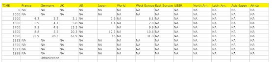
 The most complete data set on the World-Economy is the one developed by Angus Maddison and published by the OECD (here). I have entered the data into seven spreadsheets for Population, GDP, Urbanization, Real Exports, Exports, Total Hours worked and Employment. The tables are reproduced below.

To make continuous series available, I have nonlinearly interpolated missing data using the Spline Smoothing algorithm in the R programming language. Where initial data is missing, I have used the E-M Algorithm to estimate missing values. In some cases for some countries and regions, no data is available.




Boiler Plate


State Space Model Estimation

The Measurement Matrix for the state space models was constructed using Principal Components Analysis with standardized data from the World Development Indicators. The statistical analysis was conducted in an extension of the dse package. The package is currently supported by an online portal (here) and can be downloaded, with the R-programming language, for any personal computer hereCode for the state space Dynamic Component models (DCMs) is available on my Google drive (here) and referenced in each post.


Atlanta Fed Economy Now

My approach to forecasting is similar to the EconomyNow model used by the Atlanta Federal Reserve. Since the new Republican Administration is signaling that they would like to eliminate the Federal Reserve, the app might well not be available in the future.


While the app is still available, there have been some interesting developments. In earlier forecasts, the Atlanta Fed was showing GDP growth predictions outside the Blue Chip Consensus. Right now, after unorthodox economic policies from the Trump II Administration, the EconomyNow model is predicting a drastic drop in GDP (the Financial Forecast Center is only predicting a slight drop here).

Climate Change

Another comparison for what I have presented above are the IPCC Emission Scenarios. These scenarios are for the World System. Needless to say, (1) the new Right-Wing Republican administration plans on withdrawing the US from all attempts to study or ameliorate Climate Change and (2) the IPCC does not produce any RW modes for the World System (but seem my forecasts here).


World System

The longest running set of data we have for the World-System is the Maddison Project based on the work of Angus Maddison (more information is available here). Data on production (Q) and population (N) for most countries and regions runs from years 0-2000. More data becomes available as we near the year 2000. 


Available data were entered in a spreadsheet (see Population above, double click to enlarge). Missing data were interpolated with nonlinear spline smoothing using the R programming Language.


In cases where initial values were not available (see GDP above), the E-M Algorithm was used to estimate initial conditions.

From the graph of GDP above (W_Q) for the World System, it can be seen that economic growth from the year 0-1500 was basically flat. The period of British Capitalism (after 1500) had a small plateau of growth. Takeoff does not happen until the Nineteenth Century.


From a system's perspective, the only model that can be tested for the entire period is Kenneth Boulding's Malthusian Systems Model [Q,N] = f[Q,N].


When developed as a State Space model (measurement matrix above) there are two components: W1=Growth and W2=(Q-N), the Malthusian Controller. When more data is available, the Malthusian Controller can be generalized to other SocioEconomic theories.

What the Malthusian Controller shows (plotted as Q-N above) is that a long-developing Malthusian Crisis (Q<N) started in the Late Middle Ages and accelerated through the period of British Capitalism (Dark Satanic Mills) and was reversed spectacularly during the Nineteenth Century.  Takeoff in response to a deepening Malthusian Crisis would not be an unreasonable way to view Modern Economic Growth.

Error Correcting Controllers (ECC)


In another post (here), I presented Leibenstein's Malthusian Error Correcting Controller (ECC). It can be generalized to the dominant ECCs in most theoretical economic models (above). These controllers can be further generalized. For example, (X-U) and (L-U) can be generalized to (N-U), a more general Urbanization Controller which describes market expansion for economic growth. In countries and periods with limited data, (N-U) might subsume all these processes. ECCs describe important feedback processes in SocioTechnical System that are typically not recognized as such in academic literature.

Kaya Identity


The basic theoretical model underlying all the World-System models I create is the Kaya Identity. There are a number of advantages to starting theoretical development with the Kaya Identity: (1) An "identity" is true by definition Adding other variables to the model ensure that theory construction is on a solid footing. (2) The Kaya Identity is used as the basis for the IPCC Emission Scenarios.


World Development Indicators (WDI)


After WWII, extensive data sets on all countries in the World-System became available from the World Bank (here). The indicators above where chose to construct the state space for each WDI-based model. Addition indicators can be added for specific forecasts and analyses.

Wednesday, February 5, 2025

Dynamic Component Models (DCMs)


The Dynamic Components Model (DCM) is a form of State Space Model where the approximate state variables are first computed using Principal Components Analysis (PCA). The difference between a standard State Space Model and the DCM are (1) how the Measurement Matrix (see graphic above) is computed (with PCA) and (2) how the state variables are analyzed directly. The advantage of the DCM is that it separates the growth and control state variables so that growth and control can be analyzed independently (the PCs are statistically independent). In the Cannonical DCM, there are only three state variables (one for growth and one for control) that explain at least 80% of the variation in the Output Variables. The control components are typical made up of Error Correcting Controllers (ECCs). In SocioEconomic systems the ECCs are typically associated with a theoretical tradition. For example, the Malthusian Controller is presented here and generalized here. ECCs are key elements of Cybernetics and the dominant growth component is a key element of Systems Theory and Economic Growth Theory.

The DCM is implemented in the public domain R Programming language as an extension to the dse (Dynamic System Estimation) package. The dse package can be downloaded on all Computer platforms and can be run on line with a web browser (here). The DCM extensions with documentation are available here.

In the dse package, a state space model can be created using the SS command in R:


The State Space model has two forms: non-innovations and innovations:


The matrices are (double click to enlarge):


An example of the USL20 model can be found here. Other examples of the models with written analysis can be found on my blog at Blogger.com (here). For more information on Dynamic Component Models see Pasdirtz, 2007.

Properties of State Space Models

Stability

Mechanization

Controllability

Reachability

Stability

McMillan Degree


Monday, December 30, 2024

Forecasting and Scenario Construction


Of course, we cannot know The Future. Think about trying to predict the Future in 1900: World War I, The Great Depression, World War II, the Cold War, etc. Even after the fact, we have trouble explaining what happened in the InterWar Period. Yet, we persist. We try to predict the effects of Climate Change. We try to predict the path of Hurricanes. We try to predict next Quarter's Economic performance

Our vision for all this effort is (1) Science Fiction Psycho-Historian Harry Seldon created a hand-held device called the Prime Gradient that predicts the collapse of the Galactic Empire in the Foundation Trilogy and (2) Limits to Growth Engineer J. Wright Forrester created a computer program, World1, that predicted the collapse of the World System in 2050 as a result of resource shortage. These aren't the work of cranks. Issac Asimov was a scientist. J. Wright Forrester taught at MIT.

It is a mistake to think anyone knows the future. It is unknowable. What I think we can do is Explore the Future with state space models, systems analysis, multi-model inference and scenario construction. Some scenarios constructed in this manner are too awful to contemplate and must be avoided at all costs. An entire group of middle-range scenarios will seem likely but the best model cannot be chosen in advance. Systems are too complex and there is significant random error. An example of my approach is Five Futures for Russia in which I use five models of the Russian SocioEconomic system to construct statistical scenarios for the future (one is a statistical surprise). You can actually run the Business as Usual Model (BAU) on line here.

Computer simulation of statistically estimated systems models is essential. We have to get beyond the stage of arm-chair speculation which still seems to be the privileged mode of academic discourse based on The Classics. When faced with having to make predictions about the future of Climate Change, the science-based IPCC made the right choice: simulation and scenario construction. The Social Sciences have supplied few useful models for the IPCC project. Neoclassical Economics has provided the DICE Integrated Assessment Model but it is based on flawed neoclassical assumptions and is not statistically estimated or tested.

Here is some more detail on my approach. The methodology is all readily available and it remains for the Social Sciences to make a serious effort to apply it.

Atlanta Fed Economy Now

My approach to forecasting is similar to the EconomyNow model used by the Atlanta Federal Reserve. Since the new Republican Administration is signaling that they would like to eliminate the Federal Reserve, the app might well not be available in the future.

One important comment about the Atlanta Fed GDP Now App. The underlying forecasting model is based on the work of Stock and Watson (2012) on Diffusion Indexes. In Systems Theory, the diffusion index should be interpreted as a set of approximate state variables (essential variables) for a State Space model. The actual state of the system is then computed using the Kalman Filter and estimated using the dse package (see below).

Hurricane Forecasting

My vision for SocioEconomic system forecasting is to follow the US National Oceanic and Atmospheric Administration's (NOAA) approach to hurricane (Economic Crisis?) forecasting using Spaghetti Models.


Currently, Economic forecasting does not use Multimodel Inference but it is getting there! Model selection is based on the AIC Criterion.

Climate Change

My approach takes the IPCC Emission Scenarios and generalizes them to include many other variables, not just CO2 emissions and Global temperature. These scenarios are for the World System. Needless to say, the new Right-Wing Republican administration plans on withdrawing the US from all attempts to study or ameliorate Climate Change.


Compare the graphic above to my Alternate Futures for the US.

Data Sources and Estimation

There is a wealth of historical data sources that remain to be exploited for statistical analysis. My primary sources for the Late Twentieth Century are the World Development Indicators which contains a treasure trove of historical data on every country in the modern World-System. For longer-term historical analysis I use the Historical Statistics for the World Economy and the Maddison Historical Statistics Project. For detailed models of individual economies I use each country's historical statistics (for example, the Historical Statistics of the US or the European Historical Statistics). To deal with missing data I use the E-M (Estimation-Maximization) Algorithm and Nonlinear Spline Soothing. For model estimation I use the dse package in the R programming language. You can run R-code on line using the Snippets web-based service. My main purpose in using historical data is to develop models, not to understand the true course of World History.

Thursday, December 10, 2020

Confounded COVID Vaccine Trial


Figure 1. COVID incidence in RCT (source: VRBPAC briefing document)

December 10, 2011. Today, the FDA Biological Products Advisory Committee (VRBPAC) met to discuss the request for emergency use authorization (EUA) of a COVID-19 messenger RNA vaccine from Pfizer, Inc. My guess is that the graph above will be critical to approval of the vaccine. One week after injection, the experimental and control (placebo) groups diverged. The control group (red squares) showed continued COVID infections while the experimental group that received the vaccine, showed very few new cases. Even though the graph appears to be powerful evidence of the vaccine's effectiveness, I have some questions about the study's methodology.

Figure 2. Questions for the FDA

I was unable to find answers to my questions in the documentation submitted to VRBPAC so I submitted my questions to the FDA (graphic above). My general concern is about confounding, that is, other explanations that could account for the results of the Randomized Control Trial (RCT).  

Figure 3. US COVID Daily Counts (source Healthdata.org)

My concerns are based mainly on the graph above that shows a plot of actual and projected Daily COVID case counts under four conditions: (1) Mandates for masks and social distancing easing (red), (2) Universal Masks (green), and (3) Rapid Vaccine Rollout (blue). The Current Projection is presented in purple. What catches my attention in the graph is that Rapid Vaccine Rollout is not much better than the current projection after four months (the farthest into the future the projections are being made). The most effective way to control daily COVID case counts is universal masking (green line vs red line).

My questions to the FDA are focused on the behavior of all subjects after vaccination. Assume that Figure 3 rather than Figure 1, was the result of an imaginary RCT. The experimental group (Rapid Vaccine Rollout) is now the blue line and there are three control groups: Current Projection (purple), Mandate Easing (read) and Universal masks (green). In this imaginary experiment, the vaccine would still be more effective than the control groups, but not by much compared to Current Projection and Universal masking. Look back at the Y-axis of Figure 1. The difference between experimental and control at Day 112 is about 0.02 (cumulative incidence), which looks a lot like the difference between Rapid Vaccine Rollout and Universal Masks in Figure 3.

In RCT, it is typically not possible to control what the subjects do after vaccination. John Yang, a PBS NewHour reporter who was a subject in the RCTreports that he was told to go home and continue his routine, which involved staying home, social distancing and mask wearing. He knew very quickly that he was in the experimental group because he developed rather strong symptoms after vaccination. If his was a common experience, than blinding in the RCT was broken and may have influenced the behavior of the experimental subjects. Subjects maintain a diary where they list side-effects and events. What is not clear is whether subjects recorded social distancing and masking.

There are a few other issue I have with statistical analysis of the data: (1) Trials were conducted in multiple countries (Argentina, Brazil, South Africa and the United States) and multiple sites. The design is called a Multicenter Clinical Trial (MCT). The appropriate statistical model is a Hierarchical Linear Model (HLM) that allows for the analysis and control of differences across sites and countries. For example, mask use differs across countries: Argentina (90%), Brazil (60%), South Africa (70%) and the United States (70%) (source: Heathdata.org). The HLM controls these and other differences across centers. For example, imagine that all the COVID cases in the control group were from Brazil. Whether or not an HLM was used in the analysis of the Pfizer study is not made clear in the documentation. (2) Testing of the assumptions underlying the statistical model are not reported. The dependent measure is a risk ratio comparing experimental and control groups. Ratios are known not be be normally distributed and must be transformed prior to analysis. The effect of the transformation in normalizing the data should be tested.

If I learn anything more from listening to the ongoing  FDA VRBPAC hearing, I will report them as comments.

Thursday, September 12, 2013

A Flowchart For Quibbling With Research Results


This is a deceptively serious tongue-in-cheek (particularly the first line) flowchart from Dylan Matthews. You can use it to argue against a particular research result you don't like or, better yet, to anticipate attacks on your own research.

Friday, December 28, 2012

A Better Black Friday Retail Sales Model

Two earlier posts (here and here) described a simple hierarchical linear model (HLM) for Black Friday Retail Sales using data from an article in the Washington Post (here). The pedagogical purpose of the HLM exercise was to display one answer to Simpson's Paradox. It wasn't meant to be a general recommendation for the analysis of retail sales.

The analysis of aggregate retail sales is essentially a time series problem in that we are analyzing sales over time for, ideally, multiple years. HLMs can be written to handle time series problems, a topic that I will return to in a later post. The analysis of aggregate US retail sales, however, can be analyzed with a straight-forward state space time series model. If you are interested in the pure time series approach, I have done that in another post (here).

The insight from the time series analysis is that US Retail Sales are being driven by the World economy which makes sense in a world of globalized retail trade. The idea that Black Friday Sales might be a good predictor of aggregate retail sales is, based on purely theoretical considerations, not a very appealing hypothesis.

Friday, December 7, 2012

How to Write Hierarchical Model Equations

In the last few posts (here and here) I've written out systems of equations for hierarchical models. So far, I've written out equations for the Dyestuff and the Black Friday Sales models. Hopefully, it's easy to follow the equations once they are written out. Starting from scratch and writing your own equations might be another matter. In this post I will work through some examples that should give some idea about how to start.

First, I will review the examples I have already used and in future posts introduce a few more. When I develop equations, there is an interaction between how I write the equations and how I know I will have to write simulation code to generate data for the model. Until I actually show you how to write that R code in a future post, I'm going to use pseudo-code, that is, an English language (rather than machine readable) description of the algorithm necessary to generate the data. If you have not written pseudo-code before, Wikipedia provides a nice description with a number of examples of "mathematical style pseudo-code" (here).

For the Dyestuff example (here and here) we were "provided" six "samples" representing different "batches of works manufacturer." The subtle point here is that we are not told that the batches were randomly sampled from the universe of all batches we might receive at the laboratory (probably an unrealistic and impossible sampling plan). So, we have to deal with each batch as a unit without population characteristics. So, I can start with the following pseudo-code:

For (Every Batch in the Sample)
     For (Every Observation in the Batch)
        Generate a Yield coefficient from a batch distribution.
        Generate a Yield from a sample distribution.
     End (Batch)
End (Sample)
        
If we had random sampling, I would have been able to simply generate a Yield from a sample Yield Coefficient and a sample Yield distribution (the normal regression model). What seems difficult for students is that many introductory regression texts are a little unclear about how the data were generated. On careful examination, examples turn out to not have been randomly sampled from some large population. Hierarchical models, and the attempt to simulate the underlying data generation process, sensitize us to the need for a more complicated representation. So, instead of the single regression equation we get a system of equations:


where lambda_00 is the yield parameter, mu_0j is the batch error term, beta_0j is the "random" yield coefficient, X is the batch (coded as a dummy variable matrix displayed here), epsilon_ij is the sample error and Y_ij is the observed yield. With random sampling, beta_0j would be "fixed under sampling" at the sample level. Without random sampling, it is a "random coefficient". Here, the batch and the sample distributions are both assumed to be normal with mean 0 and standard errors sigma_u0 and sigma_e, respectively. I'll write the actual R code to simulate this data set in the next post.

The second model I introduced was the Black Friday Sales model (here). I assumed that we have yearly weekly sales data and Black Friday week sales generated at the store level. I also assume that we have retail stores of different sizes. In the real world, not only do stores of different sizes have different yearly sales totals but they probably have somewhat different success with Black Friday Sales events (I always seem to see crazed shoppers crushing into a Walmart store at the stroke of midnight, for example here, rather than pushing their way into a small boutique store). For the time being, I'll assume that all stores have the same basic response to Black Friday Sales just different levels of sales. In pseudo-code:

For (Each Replication)
     For (Each Size Store)
         For (Each Store)
              Generate a random intercept term for store
              Generate Black Friday Sales from some distribution
              Generate Yearly Sales using sample distribution
         End (Store)
     End (Store Size)
End (Replication)             

and in equations

where the terms have meanings that are similar to the Dyestuff example. 

I showed the actual R code for generating a Black Friday Sales data set in the last post (here). The two important equations to notice within the outer loops are

b0 <- b[1] - store + rnorm(1,sd=s[1])

yr.sales <- b0 + b[2]*bf.sales + rnorm(1,sd=s[2])

The first gets the intercept term using a normal random number generator and the second forecasts the actual yearly sales using a second normal random number generator. The parameters to the function rnorm(1,sd=s[1],mean=0) tell the random number generator to generate one number with mean zero (the default) and standard deviation given s[1]. For more information on the random number generators in R type

help(rnorm)

after the R prompt (>).  In a later post I will describe how to generate random numbers from any arbitrary or empirically generated distribution using the hlmmc package. For now, standard random numbers will be just fine.  

In the next post I'll describe in more detail how to generate the Dyestuff data.

Thursday, December 6, 2012

Generating Hierarchical Black Friday Data

Following up on my last post (here), I'll show how to generate hierarchical Black Friday data. The reason for starting from scratch and trying to simulate your own data is that it helps clarify the data generating process. In the real world, we really don't know how data are generated. In a simulated world, we know exactly how the data are generated. We can then explore different estimation algorithms to see which one gives the best answer.

My guess is that Paul Dales of Capital Economics chose regression analysis because he was testing, in a straight-forward way, whether Black Friday store sales could be used to predict yearly store sales. The problem is that, even though this can be stated as a regression equation, it does not describe how the process actually works. Black Friday sales are generated at the store level as are all the other weekly sales for the year. I'll show how that data-generating model should be written below.

Since this posting is meant to show you how to generate your own Black Friday data set, load the hlmmc libraries and procedures as usual in the R console window (using the hlmmc package is described here and the R programming language, a free multi-platform public-domain program, is available here):

setwd(W <- "absolute path to your working directory")
> source(file="LibraryLoad.R")
> source(file="HLMprocedures.R")

The hlmmc package contains a function, BlackFriday(), to generate data that looks similar to that presented in the last post. It generates data at the store level using the following set of equations:


To understand these equations, refer back to the prior post (here) where I drew red lines on Paul Dales' graph indicating fictitious store data (here's the graph again):


To make things simple to start (I'll explain how to make it more complicated in a future post), assume that the red store lines are all parallel. In terms of a regression equation, the only difference between these lines then is in the constant term.

The first equation above models that term. (Store) is an indicator variable which is zero for the largest store (imagine it's Target). Lambda_00 plus some normally distributed error term, mu_0j, determines the intercept value for that store. To create data that looked like Paul Dales', I chose a value of 1.3 for lambda_00. The smallest store (imagine a small, hip, boutique shop) was coded 3 since it was the fourth type of store by size and would have an intercept that was 3 less than Target plus some error term. Stores of other sizes would fall in between. The regression lines would all be the same with a value chosen at Beta_1j = 0.6 in the second equation.

I chose the Black Friday Sales value (the X in the second equation) by generating a uniform random number between -2 and 0 (the approximate values for the biggest store, say Target) and then shifted the value upward based on the store number (the details of this are presented in the code below). The modeling assumes that, as part of our sampling plan, we deliberately chose stores of different sizes (again, I have no idea how the original stores were sampled by Mr. Dales but the simulation exercise is designed to make me think about the issue).

The third equation above is the naive regression equation used in Paul Dales' analysis. By substituting in our more realistic data generating model in the fourth equation we see that we actually have two error terms, mu_0j and epsilon_ij. This result should sensitize us to the possibility that we might not find significant results in a naive regression model if the data were really generated hierarchically with error both at the store- and aggregate-levels .

Hopefully, the data generating model is now clear and we can start creating some simulated data. In the R console window you can type the following (after the prompt >):

> data <- BlackFriday(5,b=c(1.3,.6),s=c(.1,.1))
> print(data)
   rep store    yr.sales    bf.sales
1    1     0  0.60498656 -1.28033788
2    1     1  0.42855766  0.55819436
3    1     2  0.44069794  1.75098032
4    1     3 -1.13941544  1.15851739
5    2     0  0.67690293 -0.76659779
6    2     1 -0.02461608 -0.70585148
7    2     2 -0.29758061  0.94070016
8    2     3 -0.81785998  1.30860288
9    3     0  0.73137890 -0.76108426
10   3     1  0.10962475  0.03706152
11   3     2 -0.25702733  0.78483895
12   3     3 -0.26299819  2.27981412
13   4     0  0.18242785 -1.83775363
14   4     1  0.58905336  0.42490799
15   4     2 -0.10427473  1.13952646
16   4     3 -0.59097226  2.01763782
17   5     0  1.00266302 -0.51554774
18   5     1  0.29517583  0.17561673
19   5     2  0.07723300  1.06761291
20   5     3 -0.20515208  2.67945502
> naive.model <- lm(yr.sales ~ bf.sales,data)
> lmplot(naive.model,data,xlab="Black Friday Store Sales",ylab="Yearly Store Sales")
> htsplot(yr.sales ~ bf.sales | store,data,xlab="Black Friday Store Sales",ylab="Yearly Store Sales")

For this example, we are going to generate 5 samples (the first parameter in the call to the BlackFriday() function) from four stores of similar sizes, the stores labelled 0-3. The second command prints the data we've generated (if you entered the BlackFriday command again, you would get a different data set; if you changed the parameters, for example changing 5 to 6, you would get six replications).

The next two commands estimated and display (in the graph above) a naive regression model fit to the data. The  red regression line slopes downward as reported by Paul Dales.

The next command computes and plots (above) a separate regression line for each store. These lines all have a positive slope, each one somewhat different due to random error. Thus, at the store level, Black Friday sales are a good predictor of yearly sales while at the aggregate level, the relationship is negative or even non-existant as Mr. Dales reports. Which answer is right?

The answer to that question depends on your point of view. From the standpoint of the US retail sector, maybe Black Friday is 'a bunch of meaningless hype'. From each store's perspective, however, it is a very important sales day and explains why a lot of effort is put into the promotion. The reason the aggregate regression line is negative is simply that there are stores of different sizes in the aggregate sample. Total yearly sales are smaller in smaller stores.

Remember, I have no idea how Paul Dales generated his data, what the sampling plan was or where the data came from (stores or a government agency). It could just as easily be the case that the individual Black Friday store sales are negatively related to yearly sales, contradicting Economics 101. Before we can make this spectacular assertion, however, the data has to be analyzed at the store level with a hierarchical model. 

I'll describe hierarchical model estimation in future posts. The models essentially estimate regression equations at the lowest (e.g., store) level and then average the coefficients to determine the aggregate relationship.


TECH NOTE: If you'd like to look a little more closely at the R code in the BlackFriday() function, just type BlackFriday after the prompt and the code will be displayed. In a future post, I'll describe how to write your own code to implement hierarchical models.

> BlackFriday

function(n,b,s,factor=FALSE,chop=FALSE,...) {
out <- NULL
for (rep in 1:n) {
for (store in 0:3) {
b0 <- b[1] - store + rnorm(1,sd=s[1])
if (chop) {
bf.sales <- trunc((runif(1,min=-2,max=0) + store)*100)/100
yr.sales <- trunc((b0 + b[2]*bf.sales + rnorm(1,sd=s[2]))*100)/100
} else {
bf.sales <- runif(1,min=-2,max=0) + store
yr.sales <- b0 + b[2]*bf.sales + rnorm(1,sd=s[2])
}
out <- rbind(out,cbind(rep,store,yr.sales,bf.sales))
}
}
data <- as.data.frame(out)
if (factor) return(within(data,store <- as.factor(store)))
else return(data)
}
> 

I came up with this code by looking at the data, making some guesses and playing around a little until the graphs looked right. I'll explain this code more fully in a future post.